YERVANA search
website
Yervana is a digital marketplace for outdoor adventures across the country. It is a multifaceted web and mobile platform that connects local adventure providers with adventure seekers.
Length of project: 4 weeks
Role: Research, UX, IU design
Tools: Figma, Notion, Asana, Confluence, Jira
Team: Developers, Project manager, Data Analysis & Marketing
CONTEXT
As the sole UX designer at Yervana, a marketplace connecting adventure-seekers with local guides across the Canadian West Coast, I tackled a critical challenge. While the platform offered comprehensive functionality - allowing users to discover, book, pay for, and communicate with guides - it struggled with high bounce rates and low conversions. My primary focus was redesigning the search experience to help users find and book their ideal outdoor adventures more effectively.
The Users
The users are adults aged 25 to 65+ living in Canadian West Coast , as well as travellers, who enjoy exploring the outdoors and are enthusiasts of adventrues. They actively seek fun and engaging activities during their free time.
Problem
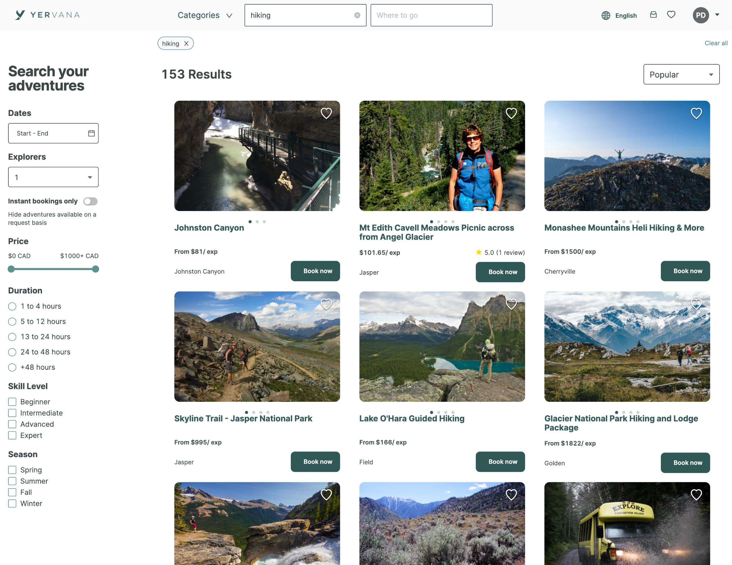
The on-page search is not working properly and leads to empty search result pages. Due to this problem, the bounce rate was high, the conversion rate was low and the time on task was too long.
business goal
Improve the search feature to generate a more effective search experience and better discoverability. Increase conversion.
Based on the problem space above came up with this research questions:"
What causes users to abandon their search, and at what points in the journey does this typically occur?
What key features and information in the search experience would enable users to discover and book adventures more efficiently?
To answer these questions in a short timeframe (4 weeks). I conducted unmoderated user testing to answer these questions.
RESEARCH
User Testing
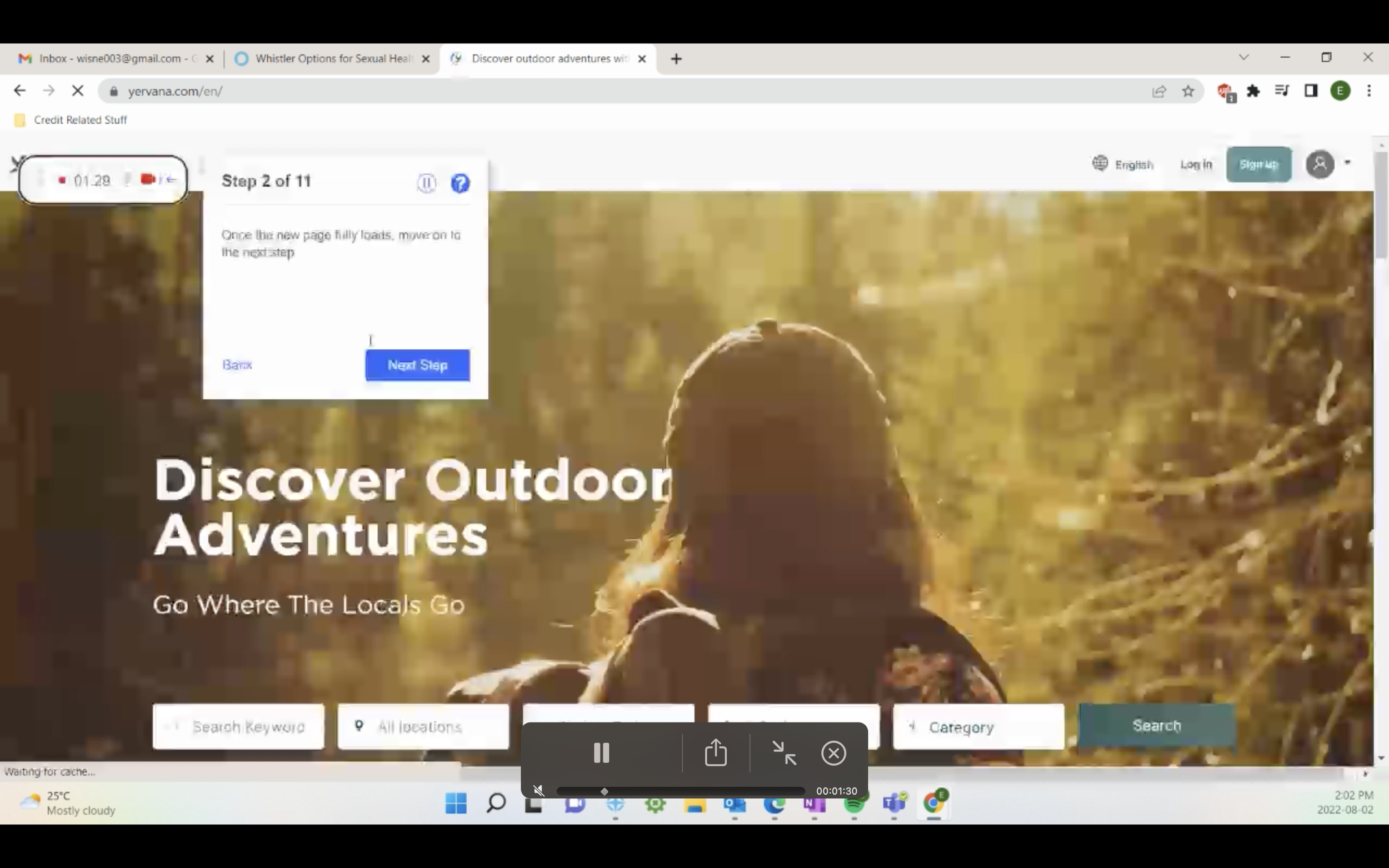
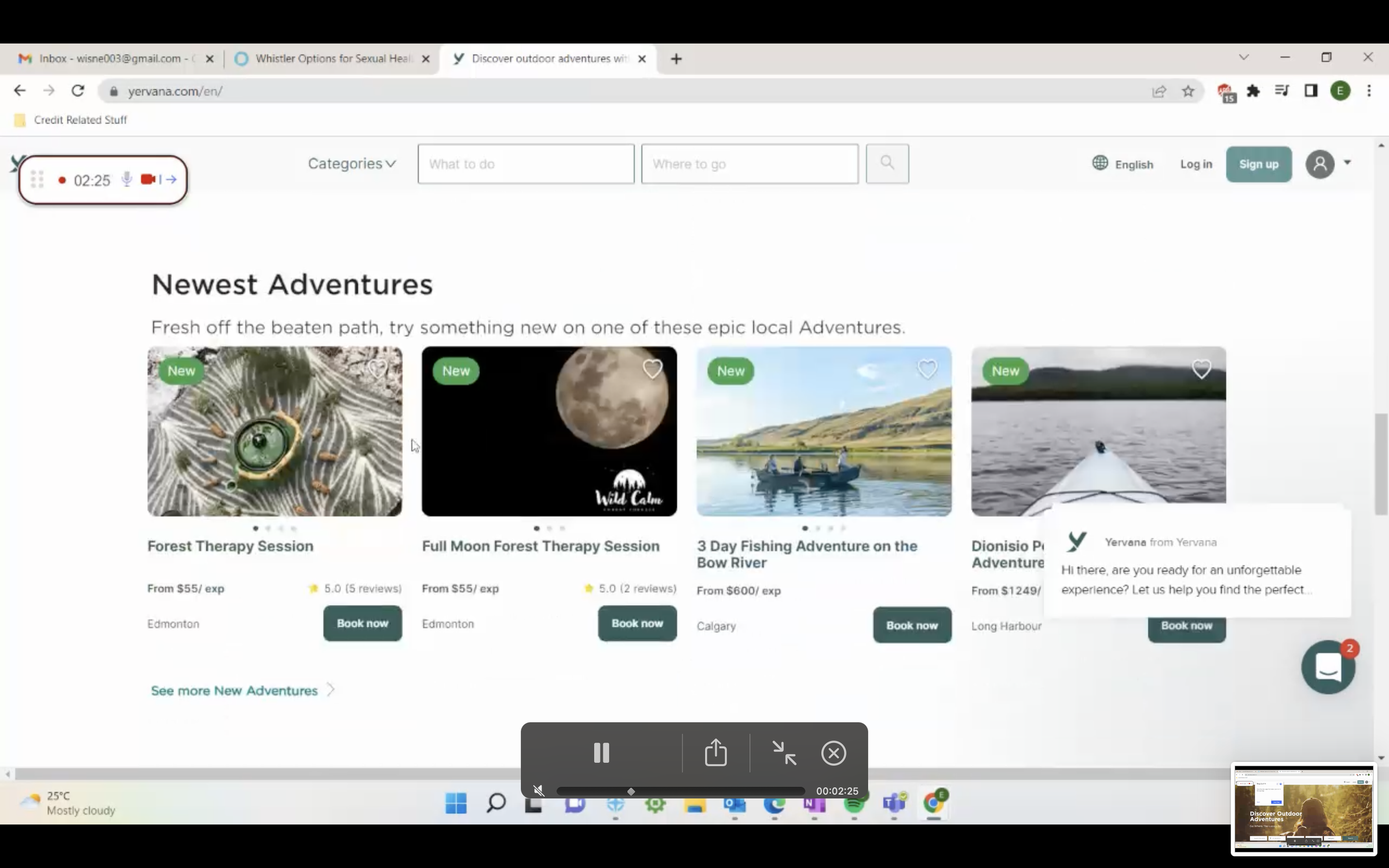
I conducted several unmoderated user tests where the user completed tasks and answered questions at their own pace, on their own time, at a time and location of their choice using the application usertesting.com. Please see two examples below.
SUMMARY
The major problem occurred in the back end of the marketplace where the keywords collected by the data team were not properly connected to the right adventures.
SOLUTIONs
Q1: Based on the data found, part of the solution was applied on the backend, where work was done on the homepage and search page loading time, relevant results logic, and location accuracy on search.
INSIGHTS question one
For the first research question I found that some of the causes for abandoning their search are getting zero results, as well as irrelevant results. For example:
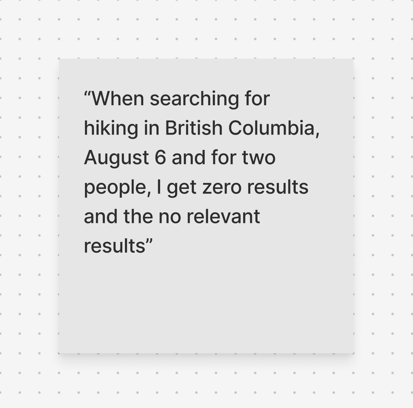
Users expressed that the adventures they got after searching were irrelevant to their search. One user said: ”When searching for hiking in British Columbia, August 6 and for two people, I get zero results (ups exclamation) and the relevant results I got, I am not sure what this is about” and “when I searched, I didn't get relevant adventures for me in Ontario, it was more urban activities I would recommend the page 3 out five because I didn't get many relevant adventures just a lot of repetition. I would use Airbnb for that”.
Some users used a province as a keyword, which showed no results.
A user mentioned, “The search filters didn’t help me, really.” A glitch was found in the following case “when selecting the category hiking, it doesn’t show hiking results, but if you refresh the website, the hiking results show up” “How I would improve the search is by adding more in-depth filters,” “if was frustrating not to find results,” “ The only thing it’s confusing is the start and end filter because you don't always have to use it,” “I am curious about how start and end filter works, for example, if I am going to a biking trail that is just mentioned, I don’t think there's necessarily start and end date.”
When all the users did the first search, they got no results. Just after removing some filters, they got results. One said: “If I searched diving in Vancouver, I didn’t get results. I removed Vancouver, and I got some results.”
Most participants had problems with the user experience mentioning the loading time on the home and adventure pages. Users said: “The adventure page is really slow” and “Homepage is not loading properly.”
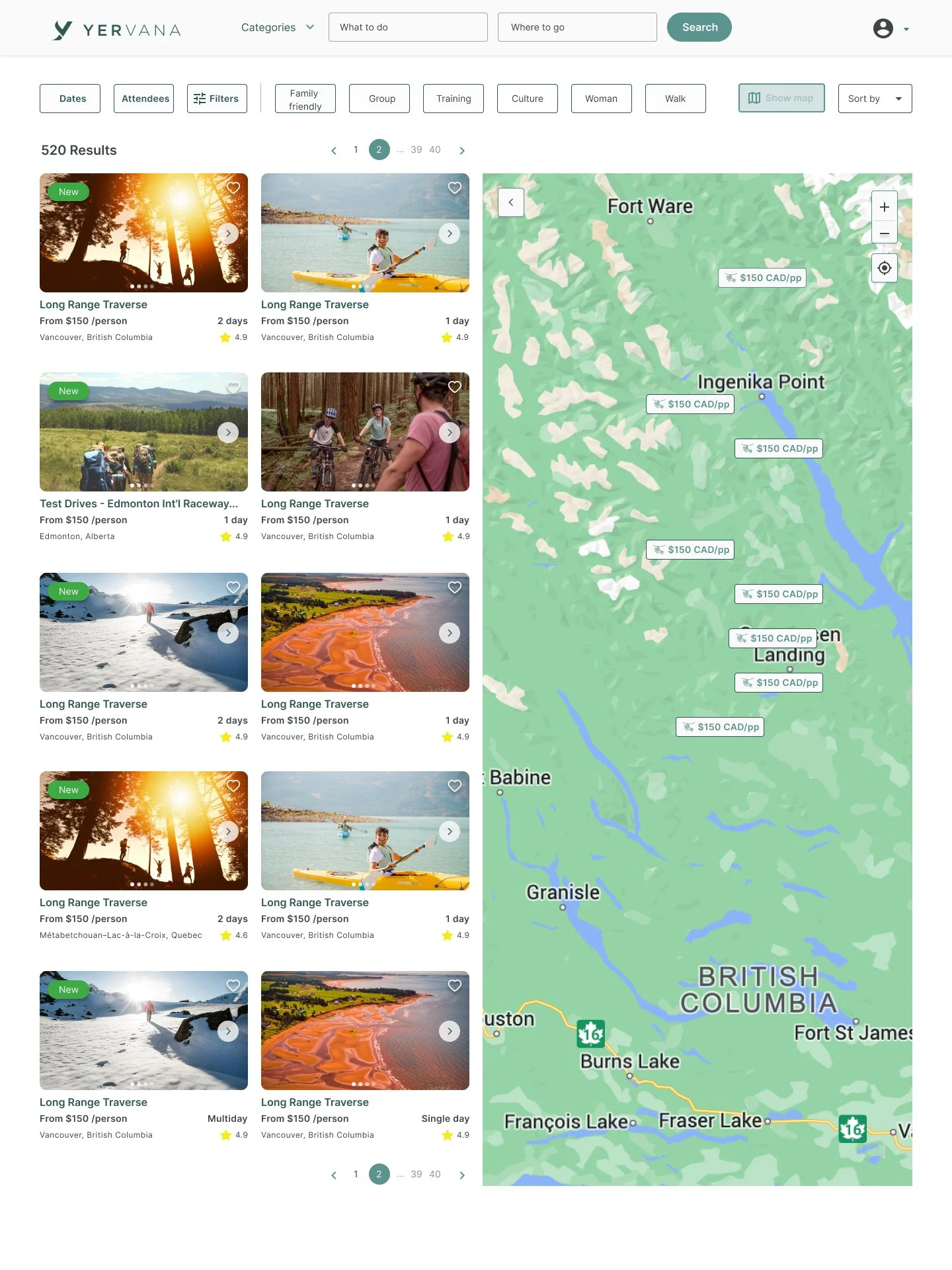
Q2: The second part of the solution to improve the discoverability was to iterate cards information, add a drop down menu on the landing page, the addition of filters that would help the user to refine the search and the map to solve the problem of deciding on location and have a better idea of what is available in a specific radius.
Homepage search
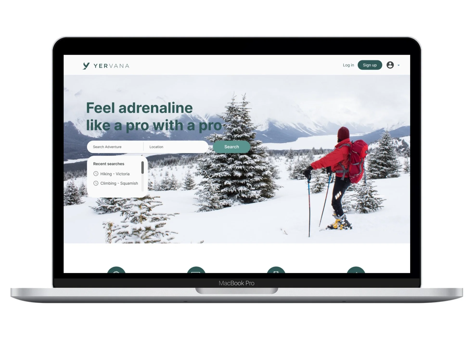
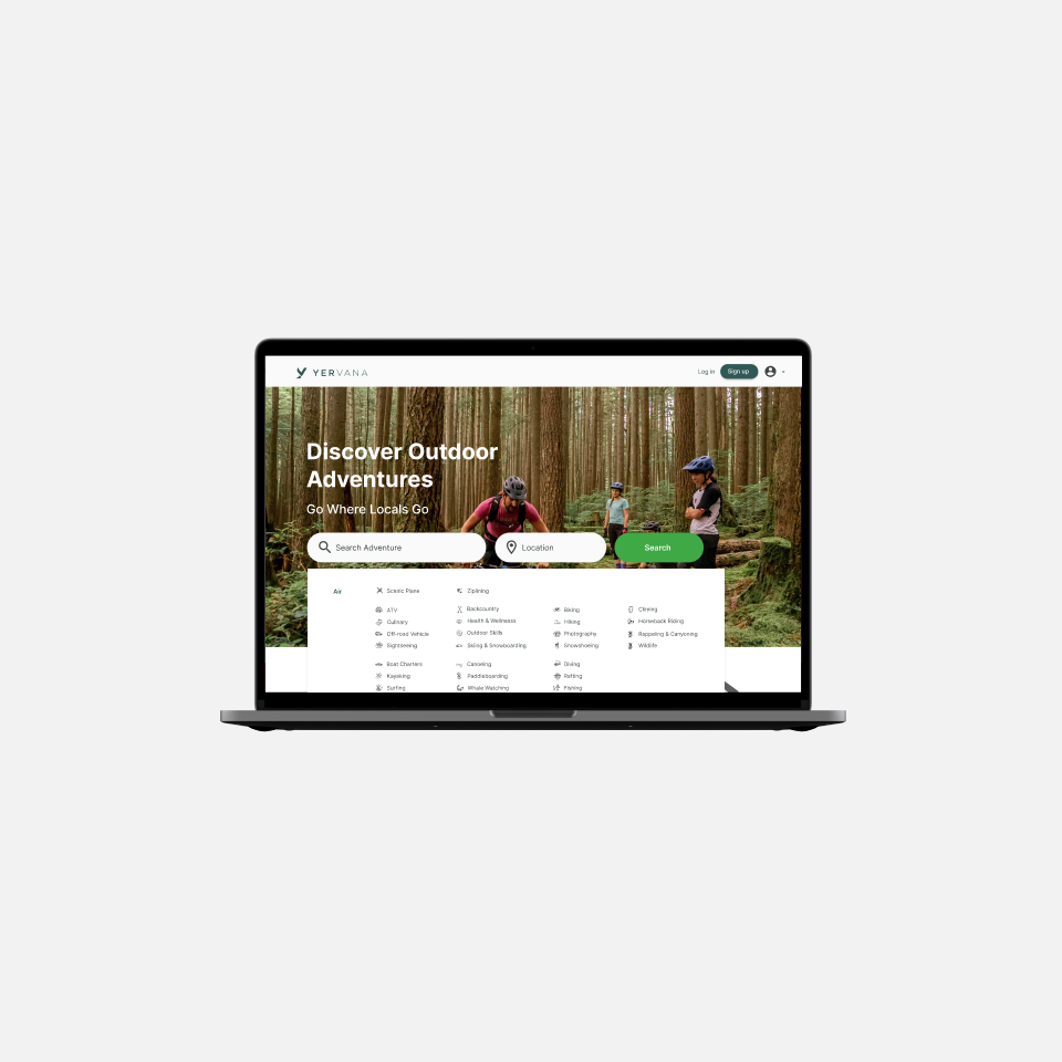
On the homepage, I added a dropdown menu with all the categories that Yervana has to offer to help the user refine their search to more quick and accurate results.
For the search bar, I decided to have keywords and location as the main input fields since these are the elements users use the most when searching.
Value proposition
Another solution implemented based on one of the pain points found was that users were unsure about what Yervana was about. One participant said: “I'm not sure what exactly this is about, I was trying to search places where I could go kayaking, or am I trying to search the local guide who can help me?” “I don’t understand the brand name, that is a little bit confusing,” and “if Yervana does provide group activities that are unclear on the website.”
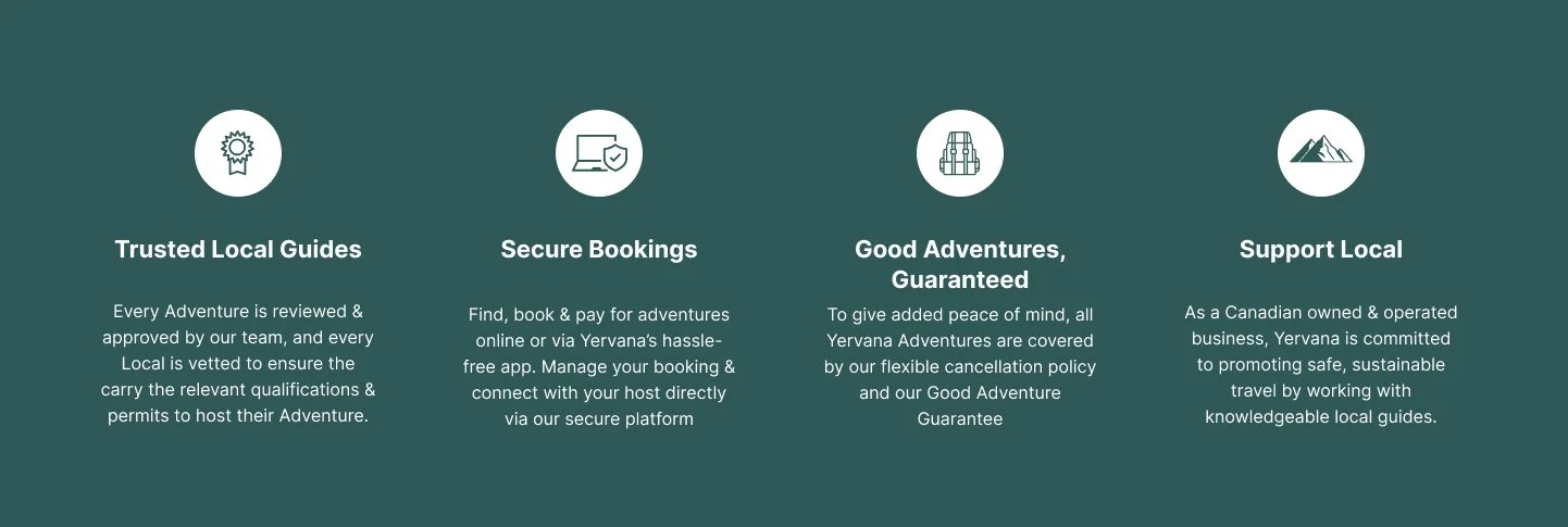
For this reason, I decided to put the value proposition near the hero section so the user can know who we are and what we do, reinforcing the hero section tagline and picture.
The search bar on the search page
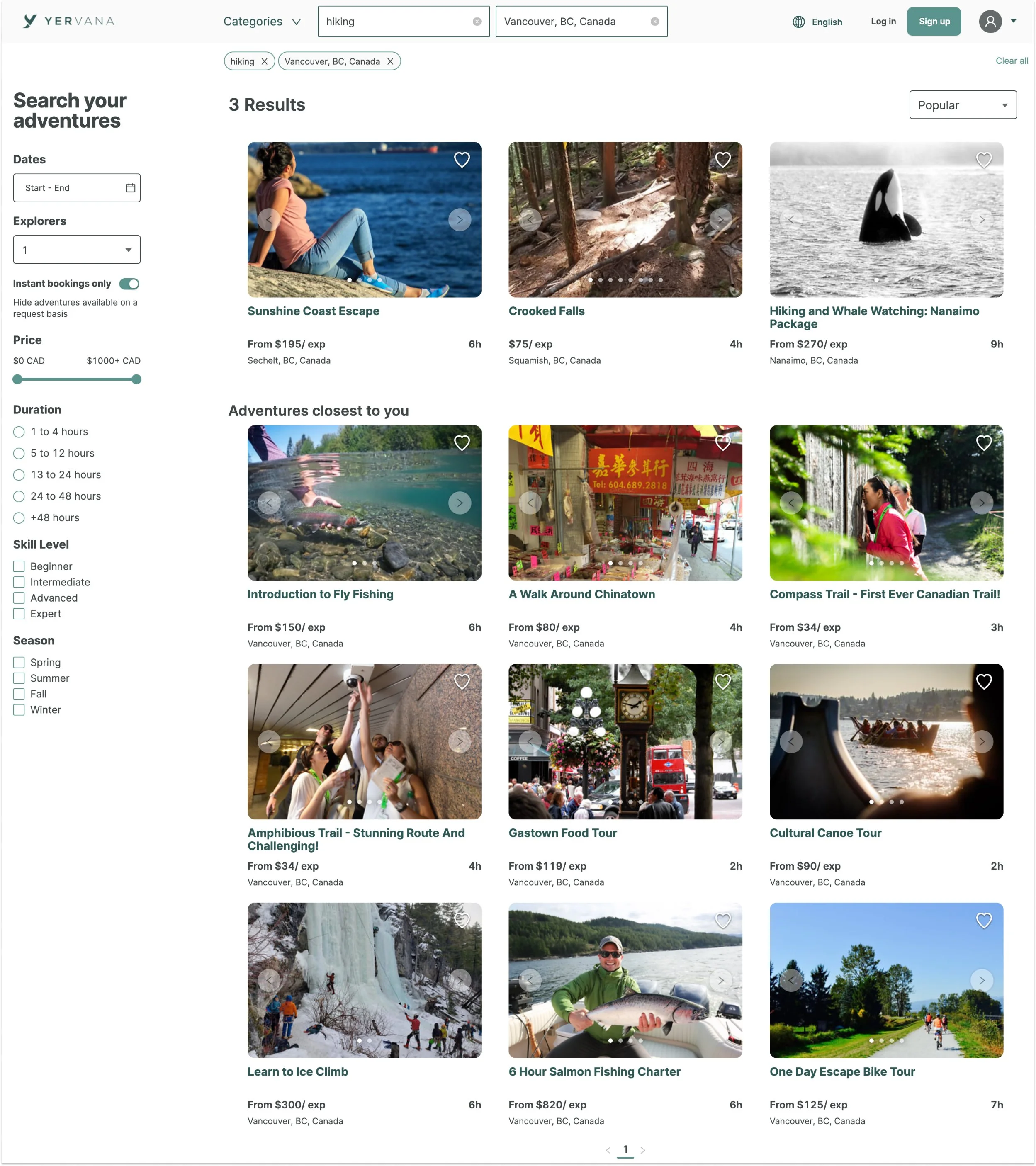
On the navigation bar, the user can search by adventure and location.
Date and attendees
Some of the most important filters are date & person.
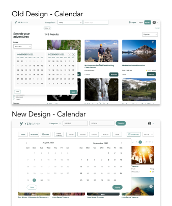
I designed a new calendar; since the previous one was difficult to understand for the user, they were not getting a clear view of the available dates decreasing the likelihood of booking.
refined Filters
A series of filter options were added in the drop-down menu to get more refined results. During the user testing, I found that the user felt that they had not enough filters to refine their search. Users said, “The search filters didn’t help me really,” “How I would improve the search is by adding more in-depth filters”, and “it was frustrating not to find results”
Visual location feature (map)
Another important feature that I decided to add was a map. Since location is one of the most important filters, according to the user testing, I added an interactive map to display location search results as opposed to purely a list view.
Impact
This was translated into more bookings, reduced bounce rate, the customer support team had less tickets and search results were more accurate.
Learnings
The project showed me the importance of collaborating and communicating well with the dev team and having their feedback in mind. It also helped me to realize the difficulty of translating user research into actionable items and design.
I understood more about the complexity of user behaviour such as when the user defines a search filter and applies it to the data to narrow down the results, they are expecting to see accurate and relevant results on the first result page, otherwise, this will have an impact on the site’s conversion rates and the user won’t trust the search tool and brand. Typically the user makes very quick judgments about the website based on the quality of search results.
